Optimize your website for mobile!
There is no scenario where optimizing a website isn’t required.
Most people browse the internet on their phones—including you! If your site doesn’t display correctly or function smoothly, visitors will leave almost immediately.
They’re too busy to deal with a clunky, frustrating website.
That means lower engagement, fewer conversions, and missed opportunities—plus lost revenue.
Thankfully, optimizing your site for mobile is easier than you think.
In this guide, I’ll walk you through how to check your website’s mobile compatibility and make the necessary fixes to ensure an excellent experience for mobile users.
Follow along as we improve your website step by step!
Table of Contents
Step 1: Check Your Website on Desktop
Before making any mobile adjustments, check your Systeme.io site on desktop:
- Go to Sales Funnels or Blogs and click on View Funnel or View Blog.
- Check if everything looks fine on your desktop.
- Confirm that images, text, buttons, and layouts appear correctly.
- If you’re satisfied with how it looks on desktop, you can move on to checking the mobile version of your website.
Step 2: Check Your Website on Mobile
Now, it’s time to see how your website performs on mobile:
- Open your website on your smartphone.
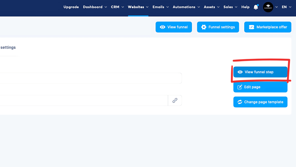
- Navigate to Websites in Systeme.io and click on Visit Funnel (just like on desktop).
- Compare the layout and elements with the desktop version.
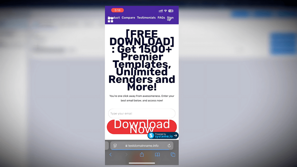
- Identify any major issues, such as:
- Navigation problems (menu not displaying correctly)
- Oversized headlines (text too large or misaligned)
- Call-to-action buttons that are too big or don’t fit properly
- Images that appear too small or misaligned
- Spacing issues making content difficult to read
If you notice any of these problems, you MUST correct them.
Step 3: Edit and Optimize Your Website for Mobile
To fix mobile display issues, open your Systeme.io website editor and follow these steps:

All-in-one marketing platform for funnels, emails & automation—forever free!
1. Enable Mobile View Mode
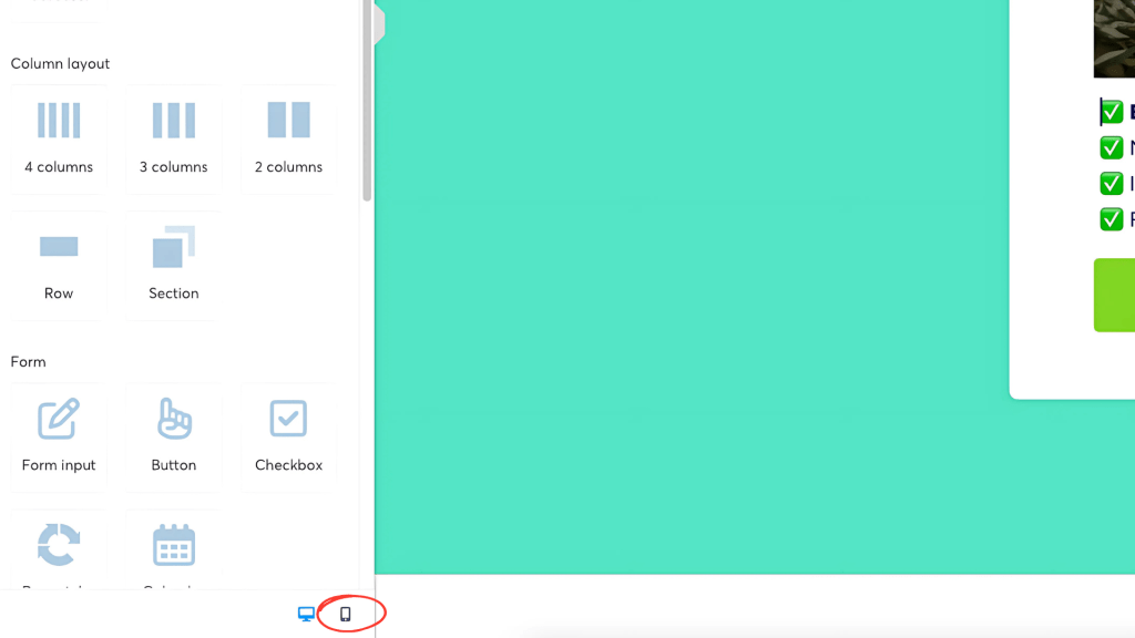
- In the funnel or website editor, locate the mobile view button in the bottom left corner (phone icon).
- Click the phone icon to see how your website looks on a mobile screen.
- Now, you can identify everything that needs to be changed.
Let’s go over the most common elements that usually require adjustments.
2. Fix the Website Menu
Sometimes, the menu is too large for the mobile screen.
The best and easiest solution is to turn it into a hamburger menu:
- Click on the navigation menu in the editor.
- Enable the hamburger menu (three-line menu) option.
- This collapses the menu for easier mobile navigation.
- Make sure menu links are easy to tap and accessible.
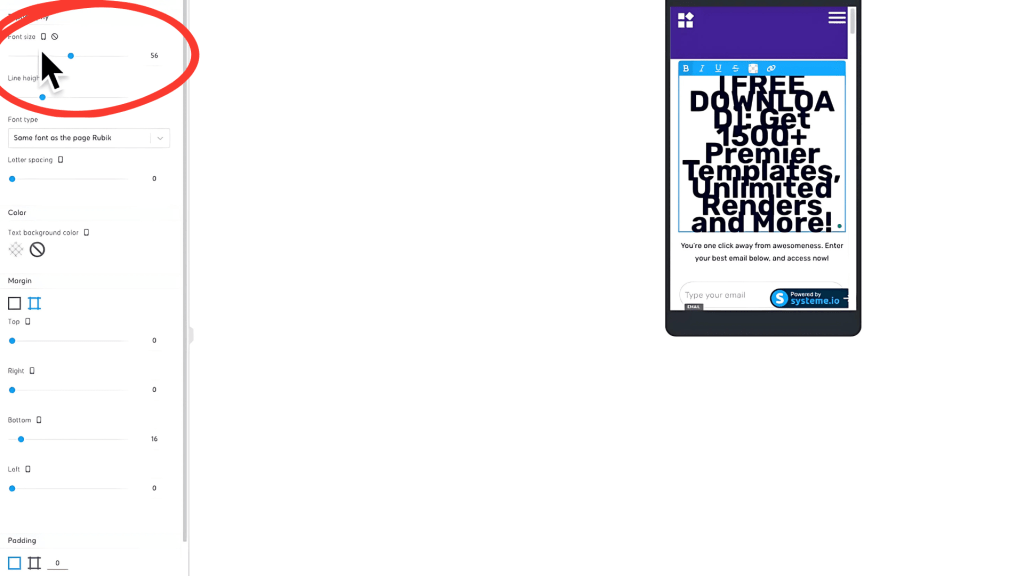
3. Adjust Headline and Subheadline Sizes
Another common issue is oversized headlines and subheadlines.
- Select the headline on your page.
- Reduce the font size so it fits properly on smaller screens.
- Maintain readability without letting the text dominate the page.
4. Resize Call-to-Action (CTA) Buttons
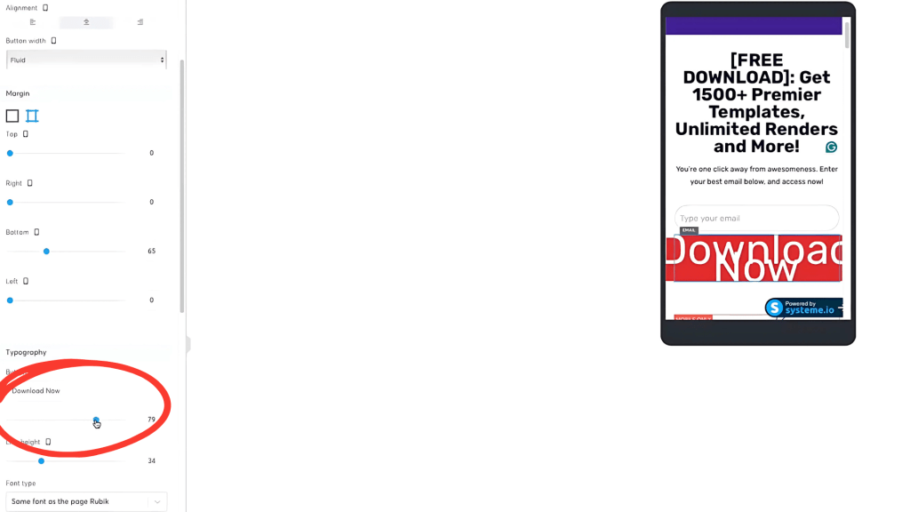
Call-to-action buttons are crucial for conversions, so make sure they’re properly optimized!
- Click on the CTA button.
- Reduce the button text size to your preference.
- Ensure the button isn’t too stretched or misaligned.
- Test responsiveness to ensure easy tapping on mobile.
5. Optimize Image Sizes and Placement
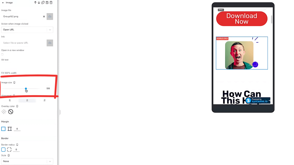
- Click on any small or misaligned images.
- Increase image size (e.g., 200px) to improve visibility.
- Align images to the center for better mobile presentation.
6. Adjust Line Height and Headline Spacing
- If a headline appears too large or too close together, tweak the line height.
- Slightly reduce the font size and add spacing for a polished look.
Step 4: Save and Review Your Changes
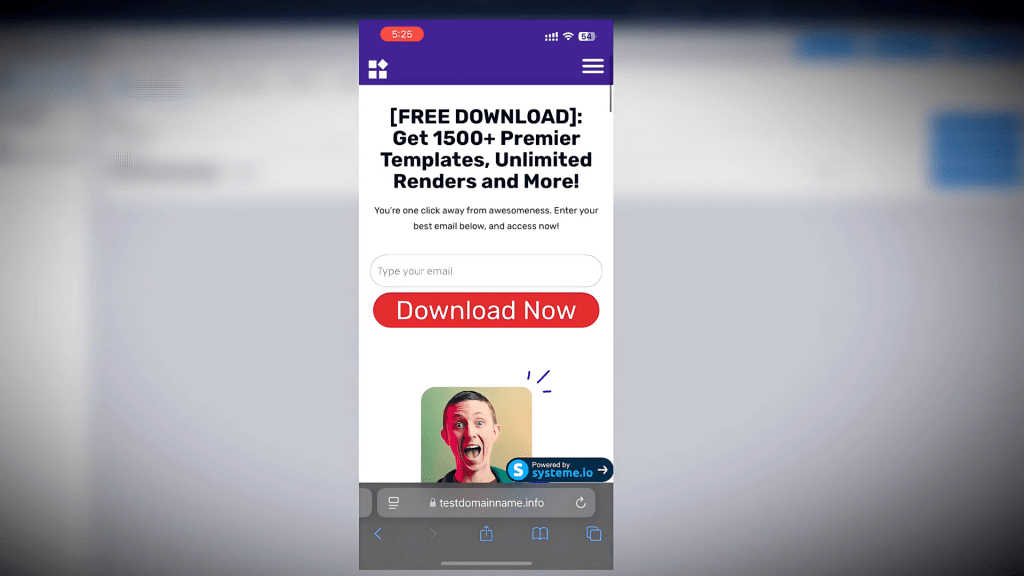
Once you’ve made all the adjustments you needed, it’s time to review your changes on a mobile device.
- Click the Save Changes button to ensure your edits are applied.
- Exit the editor and reopen your site on mobile.
- Check that all elements are properly formatted and aligned.
Step 5: Final Mobile Check
The final step is to test your website one last time:
- Open your mobile device and visit your website.
- Scroll through each section and check if everything looks correct.
- Test interactive features like menus and buttons.
- Make any additional tweaks if necessary.
If everything looks good—congratulations!
Your website is now fully optimized for mobile users.
Conclusion
Optimizing your website or funnel for mobile is non-negotiable—you CAN’T afford to ignore it.
If you don’t optimize your website for mobile, you’ll lose traffic, leads, conversions, and most importantly—MONEY!
This quick guide gave you the fundamentals of mobile optimization.
If you prefer watching a tutorial, check out the video above or visit our YouTube channel for even more tutorials and tips.
See you in the next one! 🚀


